I managed to produce the first set of letters for the font I was talking about but it’s a struggle.
Process wise I can’t find any docs or tutorials (excepts thousands of “GLOWING LETTERS IN PHOTOSHOP IN 5 STEPS”) so I started to reproduce the letters I had already sketched out to really define the identity of the font… but the reproduction aren’t close enough.
Lowercase o
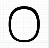
I started with the o because its the first BirdFont tutorial. This actually wen’t very smoothly. It took me some time to figure out how to draw a counter from the video; but all you have to do is draw it as a separate path and then use “create counter” button.
The h

Apparently h is a good letter to start with because once you have it you know the x-height, the terminals, the ascendants and a general sense of the angles. I started with the shoulder (or is it the spine?) and the extracted the ascendant.
At first, I thought it was rather ok — a bit formal, but alright for a first run. But looking at it again now I see some huge differences in stem widths I had preivously ignored. Needs refinement.
Struggle start with a
The a was a whole other story. When sketching, I had to re-learn how to draw this letter because I don’t shape my as like this at all. In Birdfont, I initially tried to start with the bowl, then the counter and then the spine — but when it came to the spine things were too messed up to even consider the glyph.
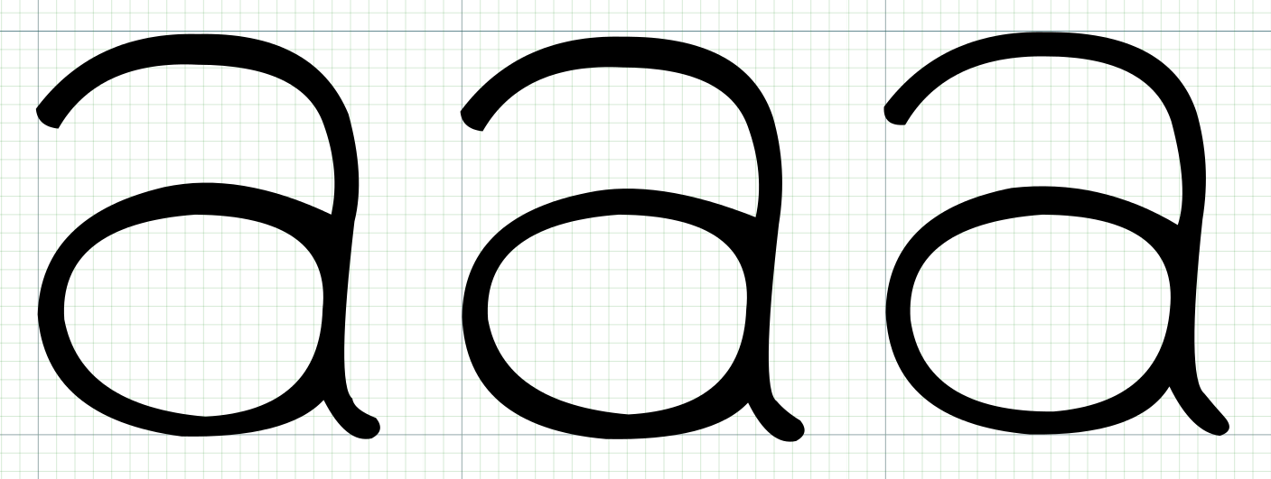
I eventually tried it the other way around and it was easier. I started with the curve of the spine and added the bowl afterwards, and eventually I added the counter and the tail. I also got my head around the built-in versioning of glyphs in BirdFont, hence the evolution on the picture.
These letters still need a lot of refining but I’ll do that once I feel more comfortable with the software.