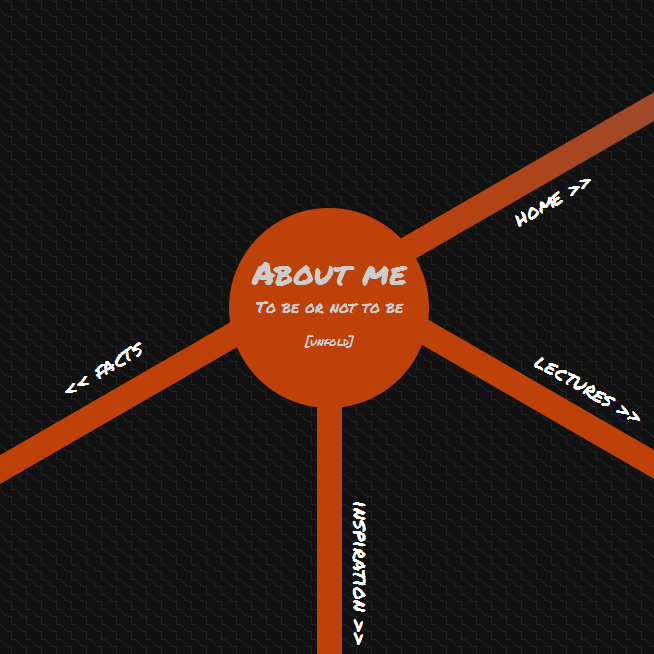
 Yet another show off post - I guess this isn’t really inspiring or anything, but it might be worth looking into. A couple of month ago, I tried out a navigation concept for what could have been my new website. I wanted something really different from what was traditionally done, something that would convey the idea of fun, adventure, etc. Things that are dear to me when talking of the web. So I came up with this idea of gigantic area that you could explore pretty much like a digital map, zooming, panning…
The best is probably to go straight to the page to see how it works. You can pan the page like a map, you can click the links, the bubbles… and there is a fallback navigation menu in case you get stuck. If it had worked out, I would probably have hidden some easter egs somewhere in the page for people to find, it could also be possible to embed javascript/flash demos…
However, I ended up dropping the concept after testing it out for some time. I think that’s really what Luke Wroblewski means in his book Mobile First : “Iterate soon, iterate often”. The concept in itself might sound good to you, but you never really knows until you try it out in the real world — same goes for designs. The usability of the site was a disaster. Painfull to use, a lot of clicking and dragging to get some meager content. I didn’t aim too much at it since it was mostly a trial, but the code would have been totally unmaintainable too — vast amounts of css, absolutely positioned elements all around the place, almost impossible to plug to a CMS.
