With my recent job change I switched from writting lots of PHP to writting lots of html, css and js. ZendStudio needed to make room for a better suited code editor, so I first gave LightTable a shot and while I’m sure it’s the next generation of IDE and it will be awesome, it’s too much of a beta right now for me.
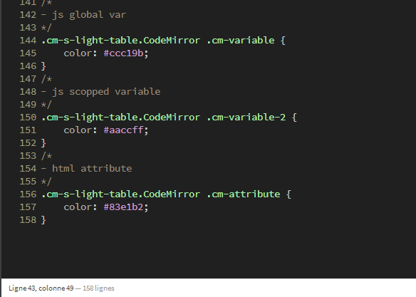
I ended up adopting Adobe Brackets, which is beta too but stable enough for me. It comes with lots of great features, but at the end of the day I missed the LightTable theme which made code surprisingly more legible (and beautifull). Brackets runs on CodeMirror, so I wrote a new theme for it which basicaly mimics LightTable. Here’s how it looks like:
Special features
It’s not only makes code good looking and very readable, it also comes with some handy-dandy stuff that I believe no other CodeMirror theme has so far — because I had to hack them together.
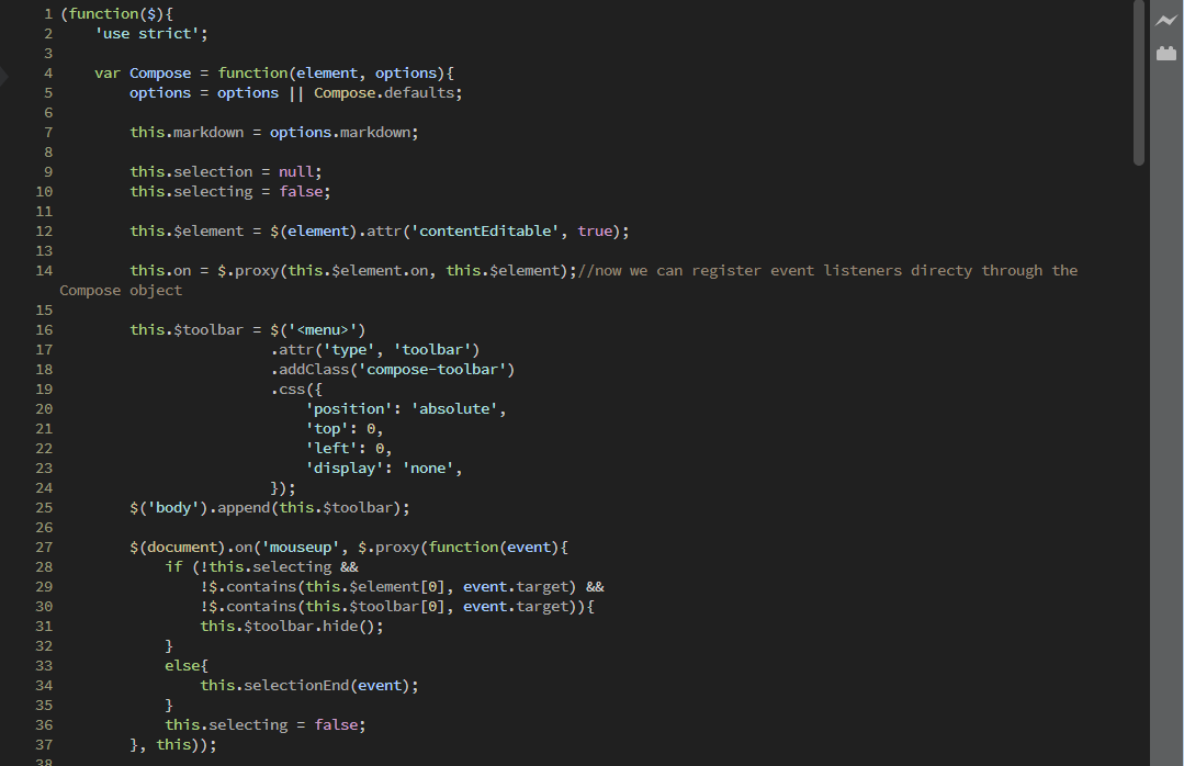
Current line highlighting
Update: Miguel Castillo was kind enough to point me an option in the Brackets menu that makes it dead simple to higghlight the current line, so the code below isn’t actually used anymore.
The line on which the caret is currently positionned stands out from the rest with its light background so it’s easy to know where you are in your code when you come back to the code editor.
Now there’s no such thing as “current line” in CodeMirror, you basicaly have a div per line of code and a div representing the caret but outside of the lines. The trick is to use the :before pseudo-element to create a rectangle and make it span the whole line. But since it also needs to be behind the actual lines of code I position: absoluted it and lost the ability to do go with width: 100%. To recreate the full width, I had to set an extremely large width and the hide the overflow.
.cm-s-light-table.CodeMirror .CodeMirror-cursor:before{
	content: '';
	display: inline-block;
	position: absolute;
	left: -5000px;
	right: 0;
	width: 9999px;
	overflow: hidden;
	height: 1.15em;
	background: rgba(255,255,255,.08);
	visibility:visible;
}
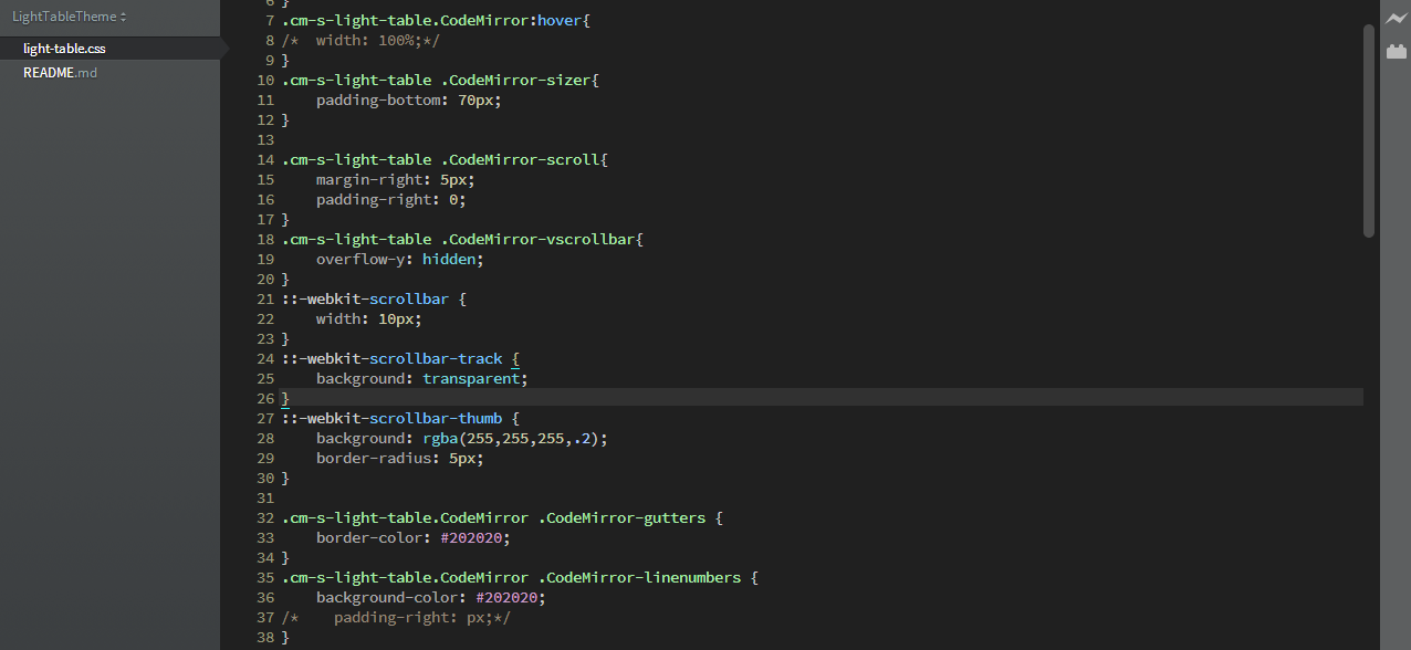
Decent scroll bars
Scrollbars on the web generally don’t look so good and you can’t do much about it. I don’t like the js solutions, but only webkit supports custom css for scrollbars and not for the main frame… and that’s cool in our case, because brackets runs on Chromium and the code frame is not the main one.
As you can see in the screenshots above, the scroll bar looks quite minimal in my theme. That’s because nobody with a fucking scrollwheel uses it (read: nobody at all). It’s just great at giving you a clue of where you are in your code, something that can be achieved with a scrollbar that calls less for attention.
Note that to use custom scrollabrs in your a CodeMirror theme, you first need to disable the default ones… and sadly, the defautl scrollbars are still displayed in the first document you’ll open in Brackets. As soon as you change document, the custom ones kick in. I guess you need to trigger some kind of repaint, but I failed to force it with pure css (I tried animations and transitions).
.cm-s-light-table .CodeMirror-scroll{
	margin-right: 5px;
	padding-right: 0;
}
.cm-s-light-table .CodeMirror-vscrollbar{
	overflow-y: hidden;
}
::-webkit-scrollbar {
	width: 10px;
}
::-webkit-scrollbar-track {
	background: transparent;
}
::-webkit-scrollbar-thumb {
	background: rgba(255,255,255,.2);
	border-radius: 5px;
}
Bottom padding
 A personnal preference of mine, I hate when my content is glued to the bottom so I made sure there’s a generous padding at the bottom.
I’ve been using this theme for the past couple of weeks now, and there’s no way I’m going back to another one in a foreseable future. You’re very welcome to hack on it, it’s on GitHub.