I don’t remember exactly when I first got into typography, but it started way before I really started caring for design at all. I fell in love with the subtility of the art and got fascinated by the power and the beauty of these shapes. I have a horrible hand writing and I suck at drawing, but I always loved to sketch typefaces. I remember having fun with serifs even before I knew they were called serifs.
The idea of designing my own typeface has been on my mind for a while but I never got past rough sketches until very recently. Someone linked to BirdFont, a free font designing tool and I decided to give it a shot. It’s probably going to take me an awfull lot of time, I might not even finish the font and if I do it will suck, but anyway.
First a word on BirdFont. I don’t know how other professional type design tools behave, but… it’snot great. It’sstill beta software, but there are some major bugs and it’s not user frienly at all. But I absolutely hate Illustrator which is the only other tool I know that might do the job. I also have to say it looks horribly hard to build such a tool and I probably couldn’t do it better for now, so props to Johan Mattson.
I’m basing my font on these sketches I did earlier this month:
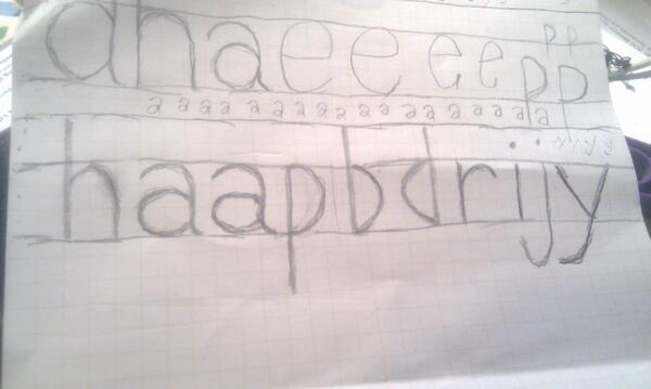
I really love the ap, it looks like a ligture but it’s not — it’s just the curves complementing each other. The descendant of the y is quite classic but I like it too, I think it will fit just right. There’s harldy anything wrong with the h, the r and the i. I’m less convinced by the b, d and j but I think I can refine them later.
Obviously it’s a very light grotesk sans-serif. These are the fonts I like most and I suspect they might be a bit easier to design since I have no fucking clue how to get width variations right on individual letters. I couldn’t find many ressources on type design online, so I’ll be sharing my progress and findings here.