After nine month of faithfull service (I started this blog on january 29th), the time had come for a slight redesign. 90% of the web is text and for sure 90% of this journal as well, so the whole design relies on solid typography. I kept it that way but got rid of Cousine, the monospaced font I used. The newcomer is Merriweather; I was already using the sans version for the menu but decided to go full Merriweather after seeing Matthew Palmers blog. Merriweather has the old-school, very scholar style that initally drew me to a monospaced font, but it’s more elegant and calls a little less for attention.
Yes, this post is about design and not BJJ.
Body Copy
The biggest but least noticable change is of course the body copy. Slightly smaller font size but bigger leading keeps the readbility intact but a lighter black and the typeface change gives a much smoother typographic grey.
Aside from the new tone, Merriweather has true apostrophes (’ instead of ‘), old style figures and more goodness.
Drop Caps
On the other hand, one of the most visible changes I made is altering the drop caps. Previously they were only used in the first paragraph of an article; now every paragraph following a heading uses one, which is a lot more often but not too much.
I’ve aso pushed the size of the drop caps to three lines and Merriweather works far better than Cousine in that regard. I’m really happy with the way this turned out.
Titles
I also changed the headings. Level 1 are now centered and slightly lighter while level 2 are left aligned and only lightly break the flow. Previous level two titles were basically not set at all, and the level one appeared much darker than the body copy because of their sizes. Another clear improvement.
Meta Informations
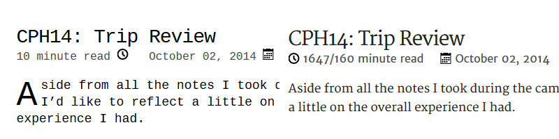
Going into the finer details, the icons in the article meta now sit before their content, which just makes more sense. I also changed the font to Merriweather Sans, like in the menu, so as to keep the voice of Merriweather only for the actual content.
Underlining
Ending with pure nerding, I used an alternative underlining method which gives me more control over the line and clears on the descendants.