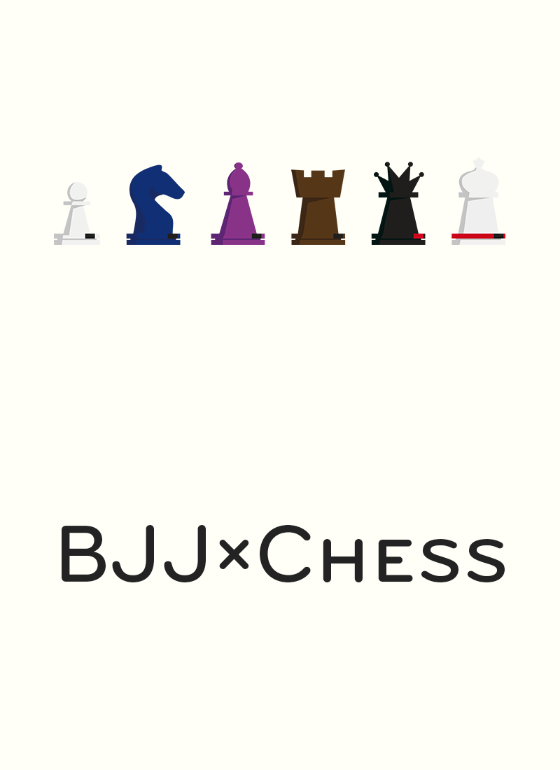
Twenty-four hours to come up with a t-shirt design you’d like to wear. High quality shirt gets produced for free. What would you do?
Without much time to think, I decided to go for a mix between BJJ and chess. I had seen some designs before but shock! None of them was “right”. Knights with higher belts than rooks, tag lines I didn’t like… Even though in the end I didn’t get the free shirt, I made a bunch of designs that I’m now sharing here.
The following images are released under a CC BY 4.0 license (basically: do whatever the fuck you want with them). The chess pieces themselves are the work of Łukasz Soszka from Piroueti. He was kind of enough to let me use them but he accepts donations, so if you make money with these designs it would be fair to give him something.

This is the design that I turned into a fabrily campaign. But I here you scream:
Why is there no bishop? Why is the king a black belt? Why ..?
Turns out doing a proper BJJ x Chess design is a tricky problem. From weakest to strongest, the six chess peices are the pawn, bishops and knights which have both equal value, rooks, the queen and the king. The king is weird because he seems quite weak, especially compared to a queen. And indeed, he is valued only slightly above bishops & knights. But then again most other peices come off the board during the game; giving the king a strong symbolic value.
And in BJJ, there are only five belts: white, blue, purple , brown and black. Six pieces, five belts: how do you solve the problem? Enters the red belt; worn by a handful of people how you wouldn’t place on a mat, but who seem to hold their own surprisingly well. Let’s go with that:

Ultimately, I abandoned this design because of mostly visual reasons:
- A king completely in red stands way too much apart and draws the eye. In layman’s terms, it looked ugly as fuck. Hence the red belt only.
- A king in white creates a symmetry with two whites on the outsides; but then it gets broken in the center. Symmetrical or asymmetrical, make up your mind.
- Also, six pieces creates more balance, making the deisgn more peaceful. Since the color tones are already cheerful, i wanted to introduce a little visual tension
- Bishops and knights have different belts, that’s another error.
Have you spotted another difference between the two designs?

In the final design, I tweaked the kings cross to look… well, more like a cross. thanks to /u/dispatch134711 for the suggestion.
So there you go, three BJJ designs that you are free to use however you like.
Post Mortem
I received my shirt a few weeks after the campaign end, as promised. I knew that printing the exact colors would be tough; I even contacted Fabrily before the end of the campaign to ask if I could help with anything in that regard — fine tuning to colors the printers can match, embed a color profile, etc. They basically said things would be fine.
On the final shirt, the rook is pink. Not purple-slightly-off kind of pink, just actual pink. I suppose you can only expect so much quality from a service like Fabrily, but it’s still disapointing. When I gave them my feedback, they blamed the DTG printing method they used and the number of colors in the design… but again, all of that could have been prevented if they had not dismissed my initial question so lightly.
What ultimately leeds me to advise against services such as Fabrily is that on top of that, the shirt shrunk a lot during the first wash (yes, I used the correct temperature, thank you). And if you want to get this design printed somewhere, make sure the printer knows what his doing :-).
